Pilot Coffee Roasters is on a mission: coffee that’s sustainably sourced AND packaged. “On our path to becoming the best version of ourselves,” the company wrote on an Instagram post, “we believe prioritizing sustainability and accessibility will always guide us in the right direction. That’s why we are thrilled to introduce our new fully bilingual + plant-based packaging.”
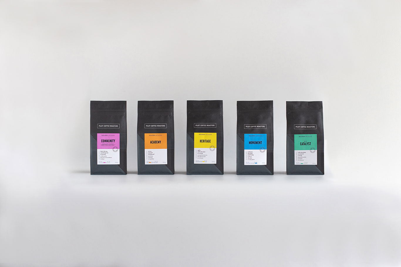
For their packaging, Pilot Coffee Roasters went with plant-based Biotrē materials. For the design refresh, Pilot Coffee Roasters added comprehensive product information in both French and English, with elements designed to simplify the buying process.
Coffee Design is a feature series on Sprudge presented by TricorBraun Flex.
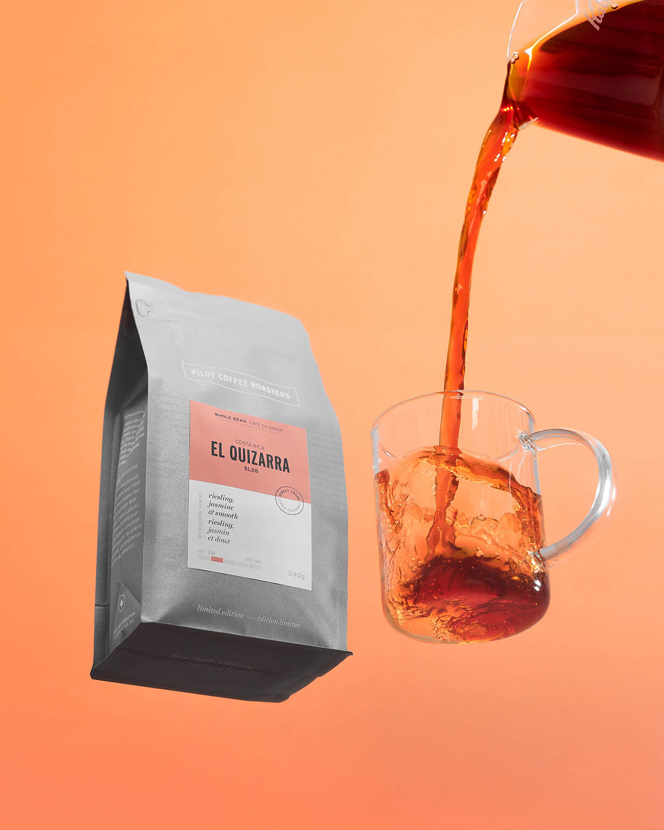
Pilot Coffee Roasters Design Additions
Roast Level Meter

“According to our customers, the roast level is the most important feature after tasting notes,” explains Pilot Coffee Roasters Marketing Manager Trevor Walsh, “as an omni-roaster, we target the sweetest point in each coffee’s development, and our ‘light to dark’ scale represents the medium roast spectrum. In the past we used a ‘classic to adventurous’ scale but found this a little too subjective. We feel this update has given customers a better understanding of what to expect from each roast.”
Descriptive Flavor Notes
Pilot Coffee Roasters’ coffee offerings feature three distinct flavor notes in both French and English with the intention of becoming more accessible to “a growing national community.” The El Salvador San Joaquin, for example, has flavor notes of apricot, hazelnut, and creamy (abricot, noisette, et crémeux.)
Bold Colors
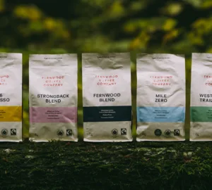
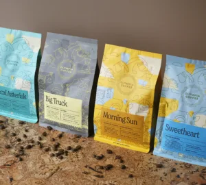
The bags themselves are in various shades of grey giving the label plenty of opportunity to pop with color. The labels themselves are supporting reflections of the company’s bold brand colors. These colors are found throughout the cafe space as well—complementing drinkware, wall colors, and furnishing accents.
We spoke with Trevor Walsh at Pilot Coffee Roasters digitally to learn more about their sustainable and design-forward quest.
Two years in, how has the re-design helped y’all on your path to becoming the best version of Pilot Coffee Roasters?
Packaging will always be a means for us to express our brand values. From thoughtful material selection, bilingual messaging, and details that support the coffee selection process, our coffee bags are a constant reminder that quality is paramount at every step. We owe our producing partners a thoughtfully designed vessel for their world-class coffee.
How long did the packaging refresh take? Were considerations made over different sustainable materials/vessels?
Michelle Wilkin, who at the time was the creative director and remains a partner at Pilot Coffee Roasters, was the architect of the project. She worked tirelessly for more than eight months to assess how we represent our values of quality, relationships and innovation. We believe that prioritizing sustainability and accessibility will always guide us in the right direction, and so we chose sustainable packaging made with plant-based Biotrē 2.0™ materials.
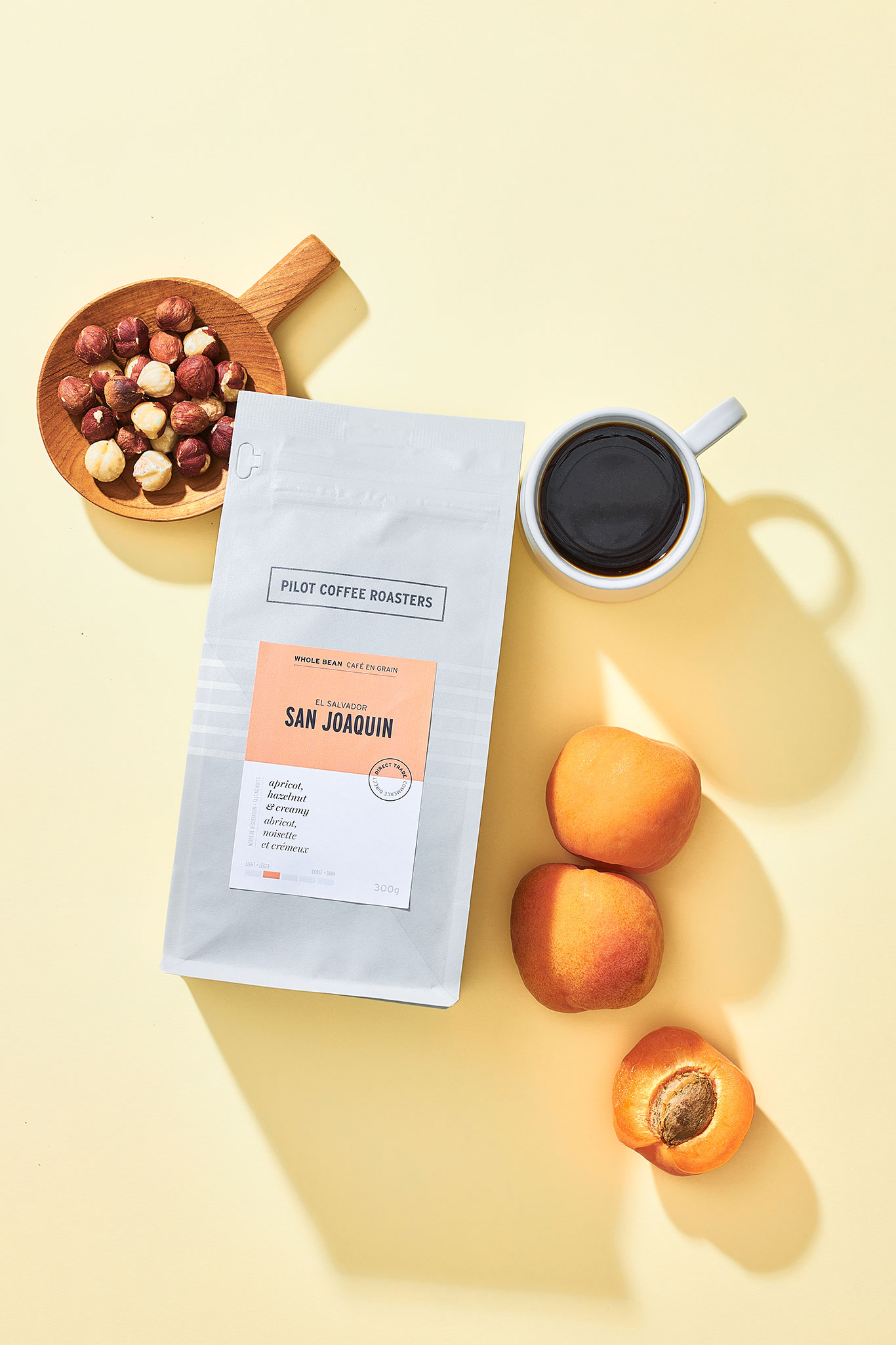
We love the contrast between the light gray/metallic/charcoal bags and the bright colors. We also love that service ware and other elements in your shop correlate with the colors on the bag!
Thank you! Our primary color palette consists of three categories: foundational neutrals—like our grey coffee bags, strong brand colors, and bright, bold supporting colors—like our coffee bag labels.
We use three different grays that identify each category: Pilot Charcoal for signature blends, Pilot Light Grey for single origins, and Metallic for limited edition releases. Label colors often represent the coffee’s tasting notes, and generally we select colors that are easily differentiated on the shelf.
One of the features is the roast level—has that been helpful for guests?
Absolutely!
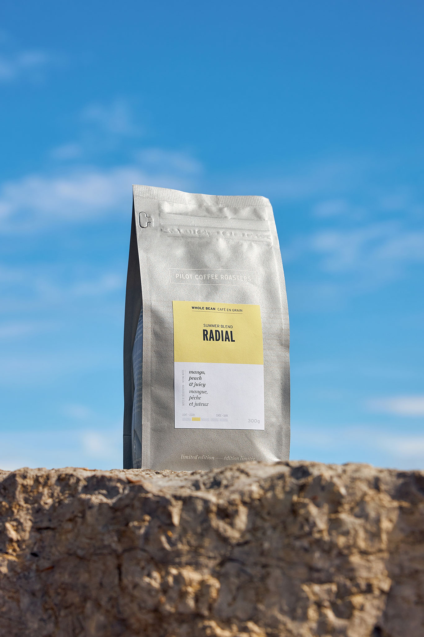
Tell us about the new summer seasonal coffee offering!
This project was a ton of fun to work on. First we asked ourselves, what does summer taste like? After lots of discussion and sampling we identified two lots that brought our answer to life: a fruity natural Bourbon from El Salvador, and an elegant washed Ethiopian from the Guji region. We chose the name “Radial,” taking inspiration from the sun’s warm gaze, and nodding to the bright, beaming flavors that come from this blend.
We also wanted to inspire a little coffee curiosity and get our customers to think beyond their morning brew. So our team developed refreshing seasonal recipes (the cold brew sbagliato was a personal favorite) to enjoy at home with Radial Summer Blend. The response has been incredible, and we’re really proud of the outcome!
The Colombia Las Palmas El Fondo is sold out online—what coffees are coming out next?
We have a lot to look forward to in the coming months. Our next five coffees are from five different growing regions, including a natural Java from Nicaragua, a returning lot from Chiapas, Mexico, and a new direct trade partner from Embu County, Kenya.
Thank you!
Explore Coffee Design archives at our exclusive Coffee Design hub.
Have a suggestion for a future Coffee Design spotlight? Coffee Design suggestions, submissions, and considerations are always free. Contact us today!
